MRY - Identity
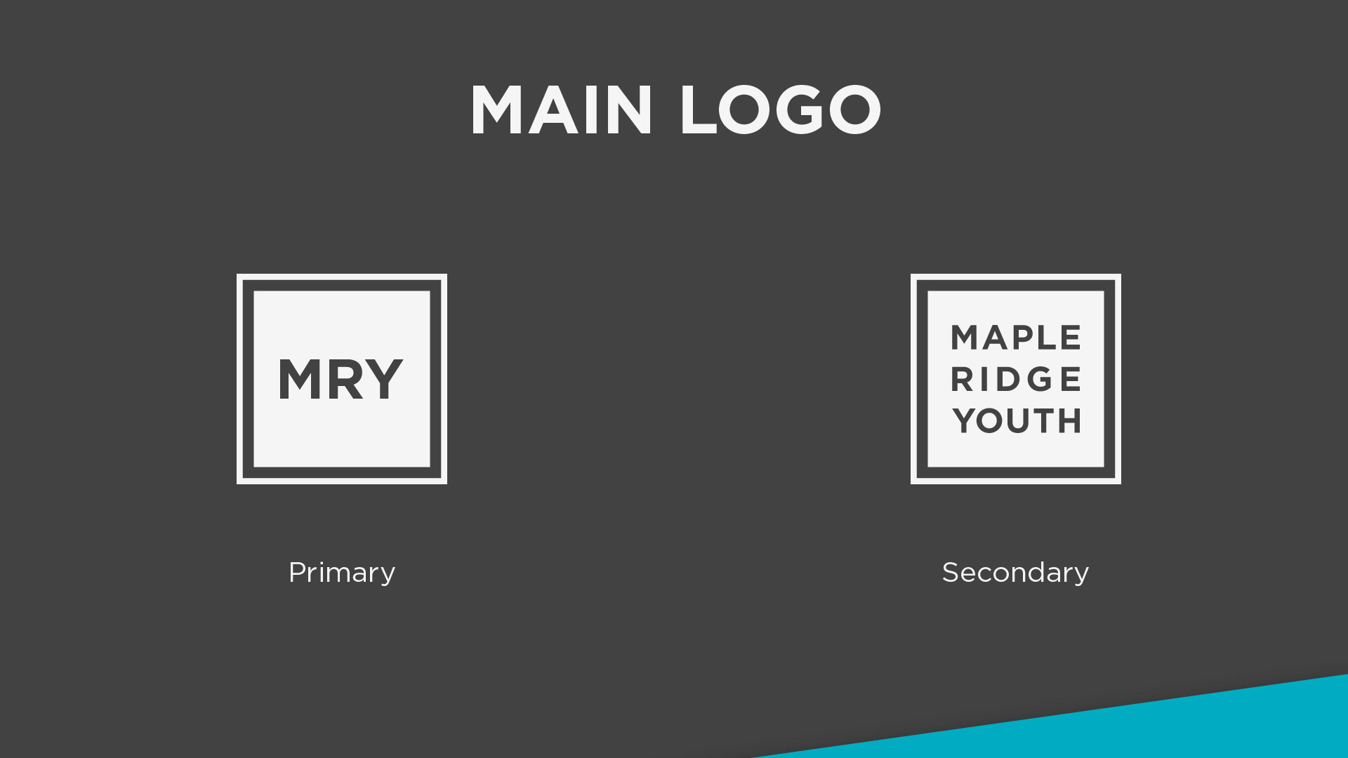
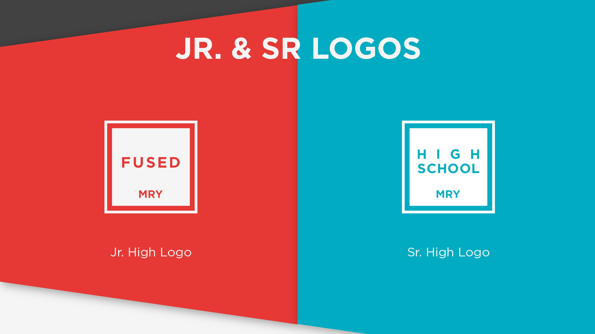
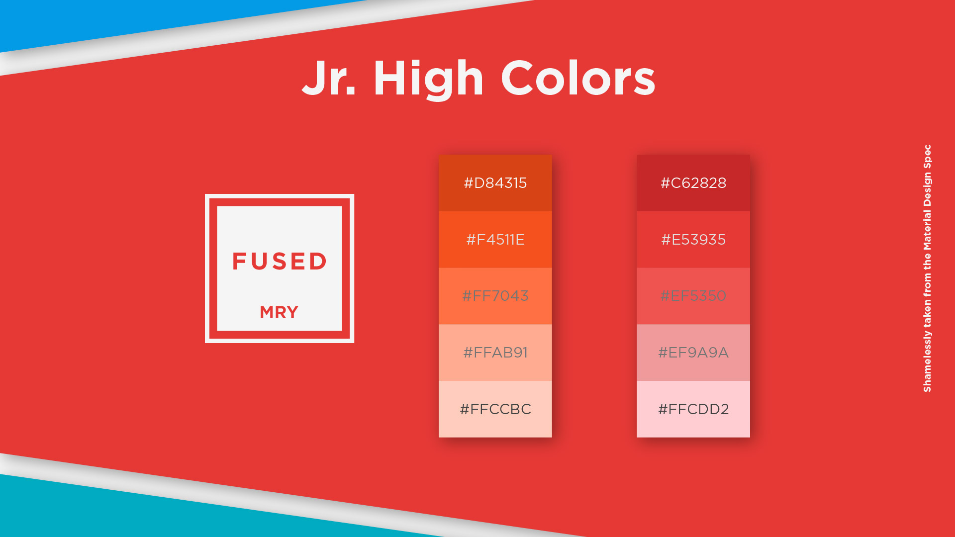
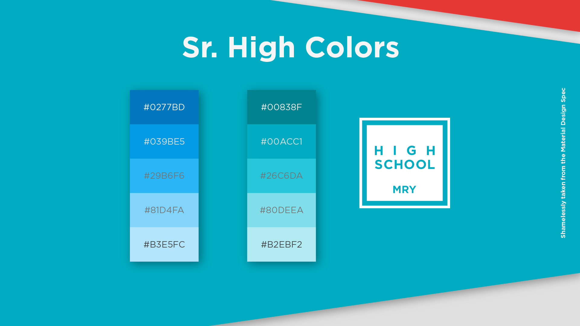
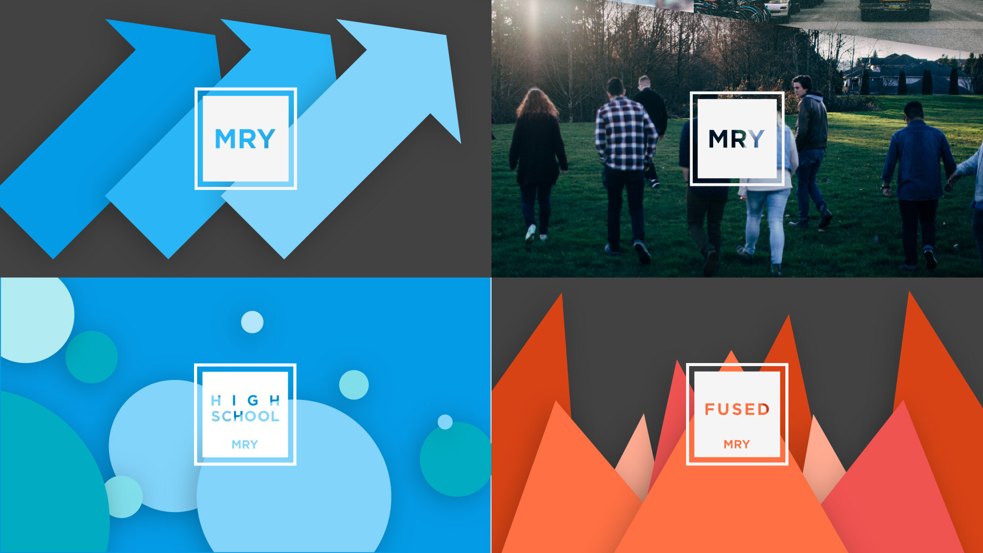
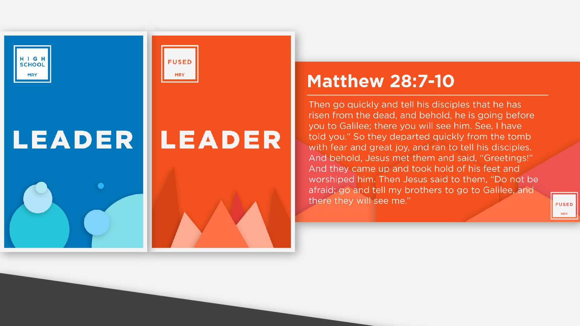
The new Maple Ridge Youth logo and respective ministry logos are a brand that represents style and comfort. The boxes that house the type are two images. The first is the inclusiveness of the group as a whole, and the second box on the outside represents the addition and comfort of new people into the group. You want to know what Maple Ridge Youth is about because the logo speaks about wanting to be a part of something. I was asked to create a basic logo for the youth ministry of MRBC as a whole, as well as create logos for the ministry inside. So for the Jr High(Fused), as well as the Sr High(High School). The client wanted a design that was friendly, bright, and welcoming. Heavily influenced by the material design spec by Google.
The new Maple Ridge Youth logo and respective ministry logos are a brand that represents style and comfort. The boxes that house the type are two images. The first is the inclusiveness of the group as a whole, and the second box on the outside represents the addition and comfort of new people into the group. You want to know what Maple Ridge Youth is about because the logo speaks about wanting to be a part of something.
I was asked to create a basic logo for the youth ministry of MRBC as a whole, as well as create logos for the ministry inside. So for the Jr High(Fused), as well as the Sr High(High School). The client wanted a design that was friendly, bright, and welcoming.